“I’m singing in the rain, just singing in the rain, what a glorious feelin’, I’m happy again, I’m laughing at clouds, so dark up above”
This project comes from an assignment at California State University Channel Islands. The assignment was to create a CD cover for a musical. I chose Singin’ In The Rain because I am a BIG musical person and wanted to do a classic. Singing In The Rain has plenty of iconic symbols I could pull from. This CD cover is a quad fold. I have a through image on the inside and four different designs on the exterior, one on each fold.

For the interior, through design, I did something reminiscent of the movie poster. Using blue at the top, like the movie poster, then using yellow on the bottom symbolizing the yellow rain coats worn. The movie poster has the three leads walking forward, umbrellas open, with Debbie Reynolds in the center with her red umbrella. I decided to have the back of the umbrellas showing, red in the middle, as if they were walking away form the viewer.
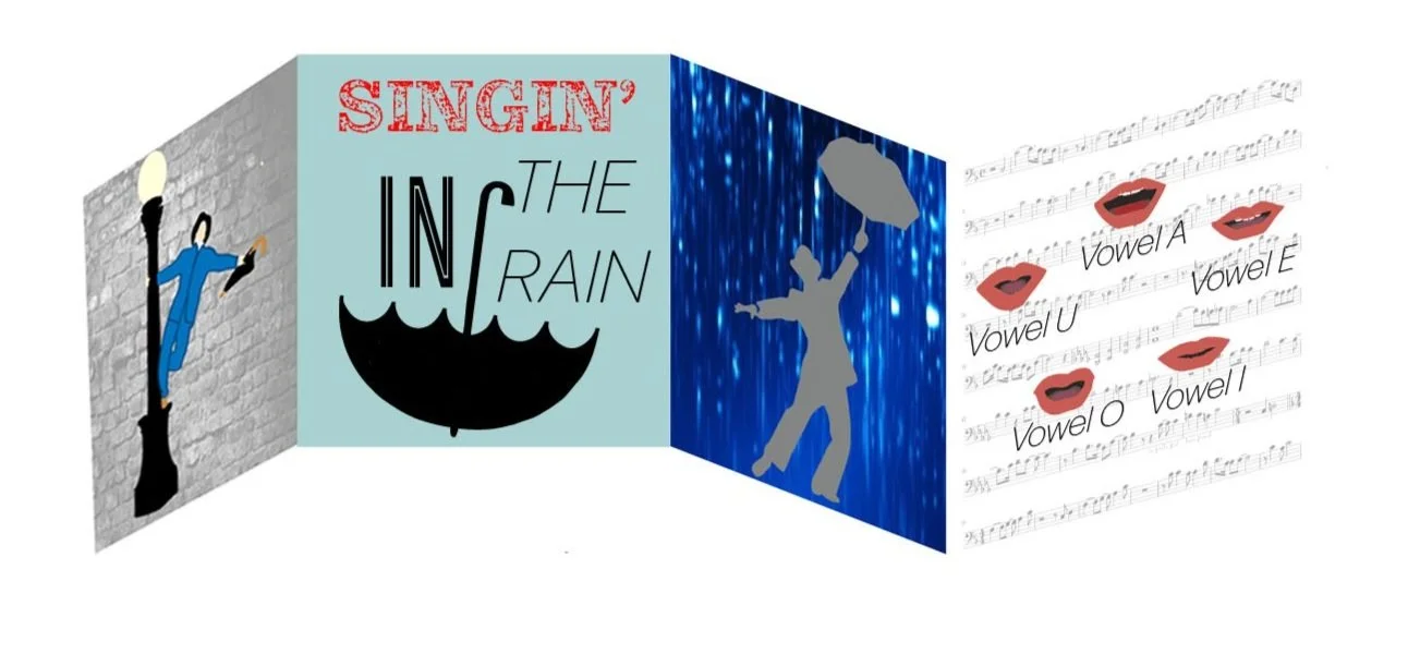
For the third fold, I used a dark blue background with water pouring down. I chose to have the background more showy/dramatic rather than realistic because these designs are meant to be symbols rather than realistic images. I then put a silhouette of the lead dancing in the rain. Stylistically I wanted to make sure he is facing the opposite way the man on the first fold is. Almost like the first and third fold are showcasing the second fold.
For the fourth and final fold, I really wanted to incorporate a piece of sheet music from the show. I used the sheet music as the background, bringing down the opacity so it’s not the main focus or overpowering the main design. In the movie there is a scene where they hold up cards with the way a mouth looks saying each vowel. I took each of those putting the mouth shapes in a circle and labeling each one.
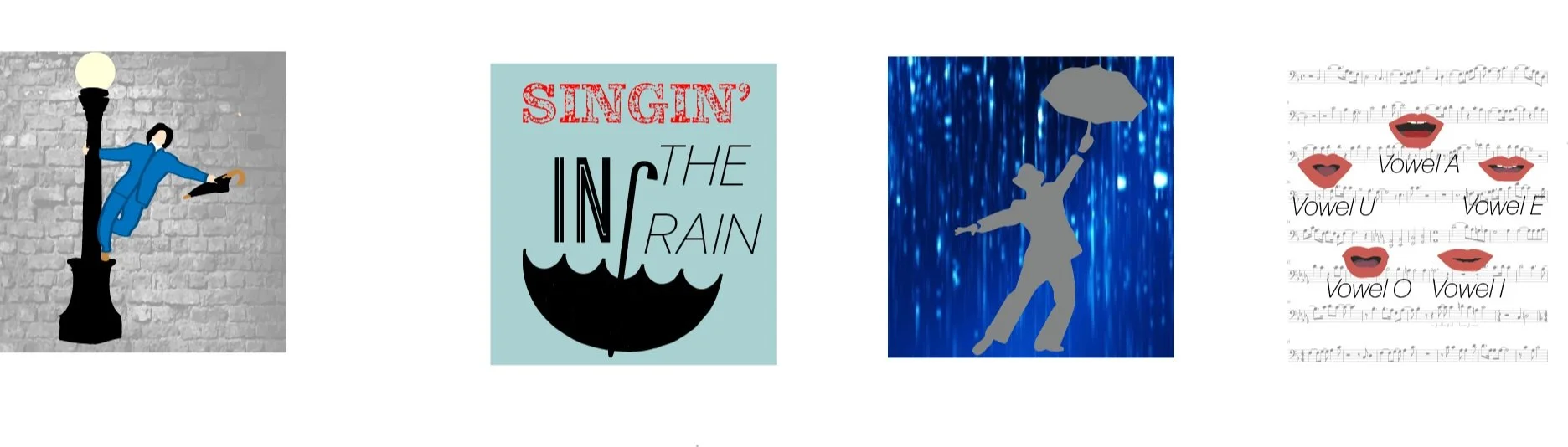
For the first fold, I took the iconic image that most associate with Singin’ In The Rain and designed it in a modern fashion. I used minimal detail in the initial man on light post design, with a grayscale brick background symbolizing the brick buildings in the background during the scene in the movie.
For the second fold, I wanted to put the name of the musical. Again keeping the image clean and more modern. I put “Singin’” in red, like the center umbrella on the design on the other side. I used three different fonts just for fun and to put some personality in a very basic design. The blue gray background is used to symbolize the rainy sky.