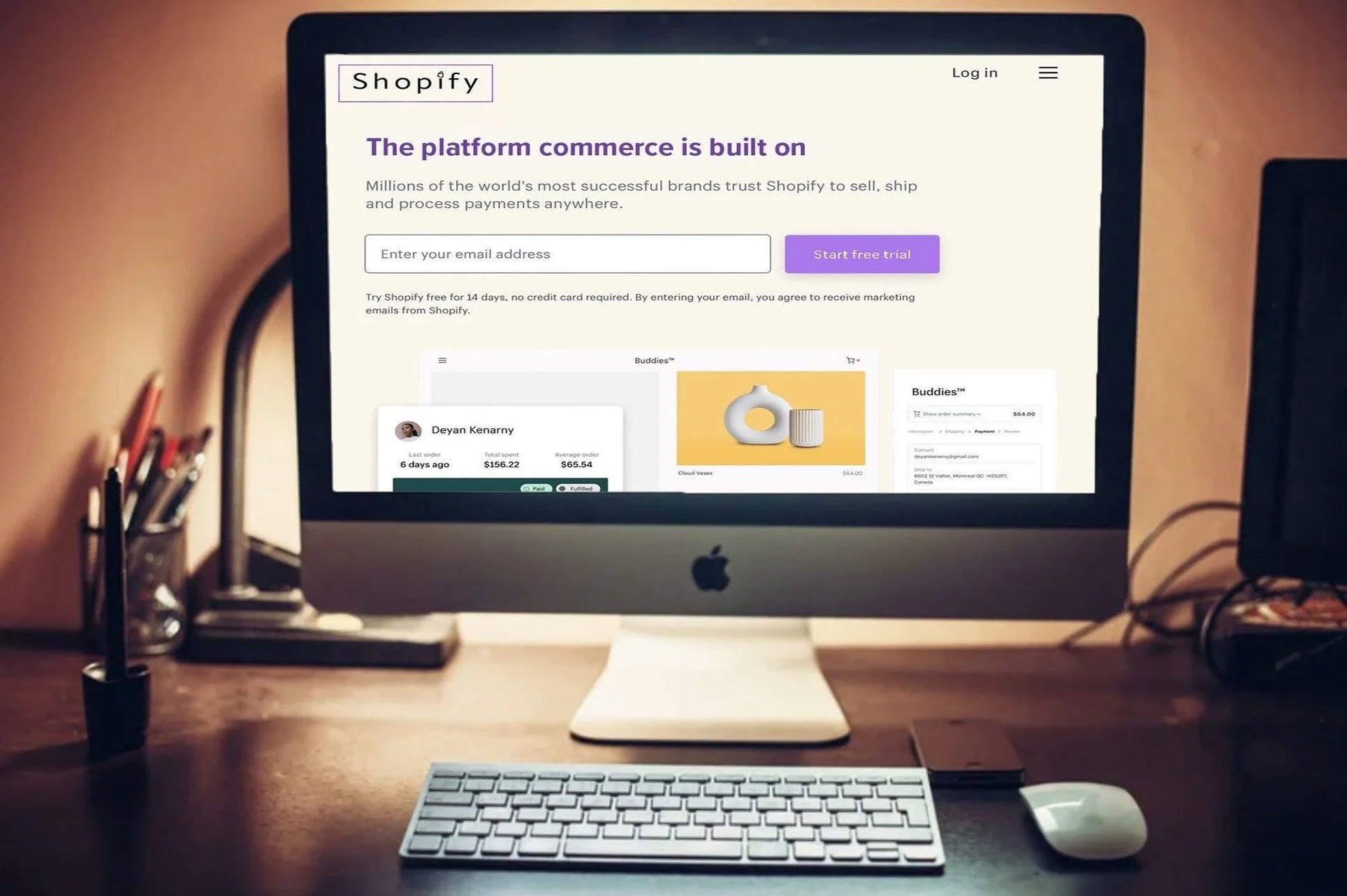
My thought was to bring the calming purple used in one aspect of their business and carry it through to the other. Replacing the bright green on their home page, I made the button a lighter shade of purple and their header the shade used used in the “Shop” app.
I very much dislike everything about their current logo and wanted to redesign it, making it more aesthetically pleasing and simplified. I used a purple boarder keeping with that color, with “Shopify” inside it in a clear font. To top the “i”, I designed a shopping bag.